Scio and Design update

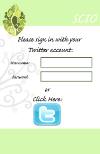
So thought id update you all to how Scio is getting on. Scio has changed quite a bit since my last post. We still have the tree however the structure has changed slightly. The project is still a data visualization however instead of tracking info from the app it tracks the info from twitter. The app is now working through twitter and allows people to tweet Ireland. The app will then add a hash tag to the tweet and allow us to track them. These tweets will appear on the map. The objective of this is to allow people to be involved in something at home and personify Ireland and allow people to express their feelings of being apart from their home country. I personally really like this idea. I had my doubts about the app beforehand as I felt it didn’t really relate to the tree and felt like two separate projects. I feel more confident about the project now that both the app and the tree have a stronger relationship to each other.

In relation to design it hasn’t officially changed much however we are having a meeting about it Monday (Dec 16th) to discuss peoples ideas regarding it. I have however changed some of the designs for the next presentation seeing as the idea has changed. I based these ideas on general chit chat regarding design among the group and some personal research into Celtic design. 

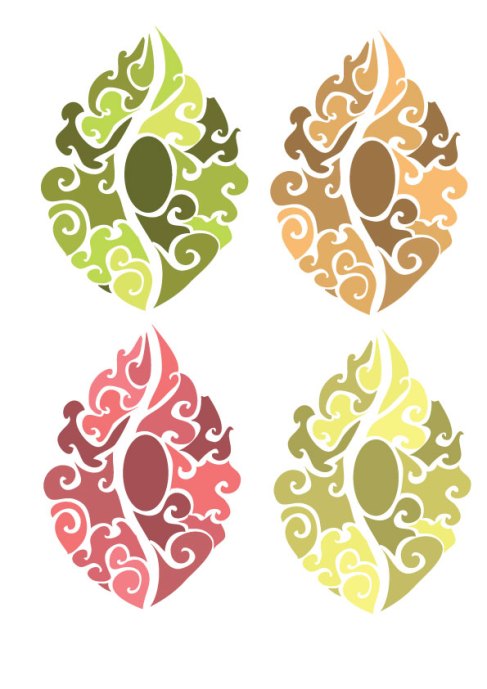
The current leaf design:

Image


The inspiration for this comes from abstract leaf designs and Celtic design.

The tree follows a similar idea as you can see on the app:

Image Image

I have also been playing with the idea of using the leaf design as the logo as it will be the most identifiable element of the whole project. All of this will be discussed however on Monday.

Our final presentation of this year takes place Wed 14th of Dec. When we receive feedback from this I hope to carry out the designs over Christmas so as to give the group as much time as possible to work on the other elements.

 

Design Update

Below is an outline of what was presented in relation to design for our first presentation:

Image

The tree which is a three dimensional structure can be set up in any public space. The tree will sit on an image of the world map roughly where Ireland is situated with roots connecting all the countries. The map will be quite simple so as to not distract from the data appearing on it.Image

ImageImage

The style of the tree will depend on the technology we use however for the moment we are looking into making it somewhat modern and abstract to catch attention as its main purpose is to display a social message however we don’t want to make It too complex as we will need to be able to access the wiring inside and we don’t want to draw attention away from the information.

Image

The leaves on the tree will vary in colour depending on what country it is representing at that time. The colour scheme for the leaves will reflect real leaf colours depending on the time of year so greens, yellows, oranges and browns.  To represent winter the leaf will be covered in frost. We chose these colours because they portray the emotions we want Scio to evoke. So for example orange for joy, green for calmness as these are the emotions you would generally associate with home.

Image

A similar colour scheme will be used for the app with the leaves being a predominant feature. For Android phones there will be a leaf widget on screen. When you get a message from a contact a symbol will appear beside the leaf and the leaf will change colour depending on the sender’s location. As you can see there is an image in the center of the screen. This image will represent the time of day in the senders country.

ImageImage

So for example if the sender is in Australia the image will be a general representation of Australia and its colour scheme will depend on the time. The app will contain country representations for the most popular countries with a generic option also available. This is to make the app a bit more personal.

Image

When you click on the leaf you will be taken to the conversation. This will be as simple and minimalistic as possible because we are aware that when people emigrate its family that they want to stay in contact with and we want it to be easy to use for people who are not so familiar with technology. For the app we will use a web-safe san-serif font as studies have shown that a user engage with a site better if the font is clear.

Image

The contacts list will be of a similar style with people still being represented by their leaf. So Scio doesn’t get cluttered and to keep it personal there’s a restriction on the number of contacts you can add.

Image

Finally we have Branch Out which is the Augmented Reality feature of the app. When the user views another Scio user through their device leaves will appear to float around them.

Data Visualization take two

As our project is heavily based around data visualization I have been looking into some examples of visualizations similar to what we have planned as well as some tips and tools for creating these. I started by looking at tips for data visualizations. These included:

  1. Keep it simple
  2. Have a specific message you want to communicate
  3. Select the right form to show your data. E.G. bar chart, pie chart etc
  4. Use titles to describe the visualization
  5. Exclude redundant data and don’t cluster it with unneeded imagery
  6. Add hierarchy to your data. Some data will be more relevant than other.
  7. Use a clear design
  8. Look at other examples showing similar data
  9. Revise and Edit
  10. Know your Audience
  11. Tell a story
  12. Get interactive
  13. Avoid 3D as it distorts the information

I then looked at some of the tools people use to create data visualizations:

  1. http://www.wolframalpha.com/
  2. http://www.chartjs.org/
  3. http://visual.ly/
  4. http://www.wefeelfine.org/ (This one explored human emotion)
  5. http://moritz.stefaner.eu/projects/revisit/
  6. http://www.betterworldflux.com/
  7. http://www.betterworldflux.com/
  8. http://www.google.com/drive/apps.html#fusiontables
  9. http://www.dipity.com/
  10. http://jpgraph.net/
  11. http://circos.ca/
  12. http://topsy.com/
  13. http://twitter4j.org/en/
  14. http://www.wordle.net/
  15. http://tagcrowd.com/
  16. http://www.vuvox.com/

I then looked at data visualization and emotive design and found a slide show from The Tableau 2013 Customer Conference which talks about the impact that design and emotion can have on a visualization focusing on Fireworks injuries and Twitter TV Sets.

http://datablick.com/2013/09/13/using-design-and-emotion-to-create-a-data-visualization-with-impact/

Some examples relating to this area were:

Some examples related to emigration were:

Data Visualization research

Having looked into the theory behind data visualization I found works from Edward Tufte who is credited as a pioneer in the field of data visualization and Nigel Holmes who was one of the first information designers to bring data visualization to a large mainstream audience having worked at Time magazine making explanation graphic visualizations.

Edward Tufte coined the term “chartjunk” which refers to the useless decorative non informative imagery that can oversimplify and distort data. He believed that data visualizations should be data rich. Tufte uses the example of Dr John Snow’s data visualization on the cholera breakout in London in 1854 as an example of how data visualizations can reveal the solution to a problem. By analyzing the position of the points he used to plot peoples death Snow noticed that the breakout occurred prominently around the Broad Street Water pump therefore locating the source of the problem and allowing it to be dealt with.

Image

Unlike Tufte Holmes uses graphics to help explain the information. Both men have different approaches to data visualization however both have a valid point. Tuftes point highlights that sometimes imagery can distort the data. Holmes theory focuses on the use of imagery to explain the data. Both theories should be considered when designing data visualization.

“Sometimes decoration can help editorialize about the substance of the graphic. But it’s wrong to distort the data measures – the ink locating values of numbers – in order to make an editorial comment or to fit a decorative scheme” – Edward Tufte

“Too much illustration gets in the way of the info; too much reliance on abstract data can leave the reader floundering in a sea of lines and numbers.”– Nigel Holmes

Reference: http://www.slideshare.net/thompsonkaren/data-visualization-theory

David McCandless: The beauty of data visualization

David McCandless turns complex data sets (like worldwide military spending, media buzz, Facebook status updates) into beautiful, simple diagrams that tease out unseen patterns and connections. Good design, he suggests, is the best way to navigate information glut — and it may just change the way we see the world.